-
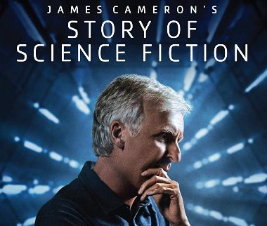
DVD Review: James Cameron's Story of Science Fiction
By Chaz LippWhile this 2018 AMC series is by no means comprehensive, it's an entertaining, casual exploration of… -
Music Reviews: Bryan Ferry Live, Plus John Fusco, Phil Ochs, Rick Berthod
By Jeff BurgerA 46-year-old concert from Roxy Music's Bryan Ferry, plus previously unreleased tracks from the great… -
Music Reviews: Brian Wilson and Van Dyke Parks’s ‘Orange Crate Art,’ Plus Jenny Reynolds, Jason Daniels Band, Easy Love
By Jeff BurgerBrian Wilson and Van Dyke Parks's "Orange Crate Art" reappears in a 25th anniversary edition. Plus three… -
Music Reviews: The Explorers Club, Plus Julian Taylor, Al Hendrix, Mark Fredson
By Jeff BurgerThe Explorers pay tribute to late 60s/early 70s pop rock. Plus, Canada's Julian Taylor, rockabilly from… -
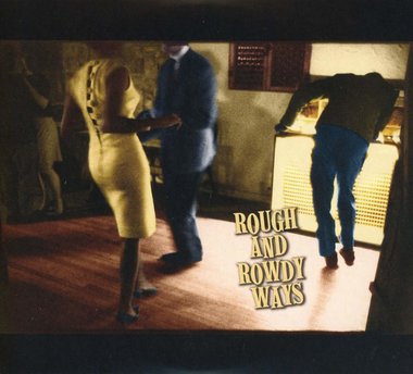
Music Review: Bob Dylan's 'Rough and Rowdy Ways'
By Jeff BurgerThink Bob Dylan's best work is behind him? His first new album of original material in eight years suggests… -
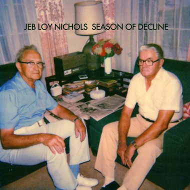
Music Reviews: Jeb Loy Nichols’s Masterful ‘Season of Decline,’ Plus VickiKristinaBarcelona and Kristen Grainger
By Jeff BurgerA gem from the little-known Jeb Loy Nichols, plus VickyKristinaBarcelona covers Tom Waits and Kristin… -
Music Reviews: Iggy Pop’s ‘The Bowie Years,’ Plus John Craigie, Anthony Garcia, and Lee Gallagher
By Jeff BurgerJames Osterberg—who goes by the decidedly more hip-sounding name Iggy Pop—has twice… -
Music Reviews: John McCutcheon’s ‘Cabin Fever,’ Plus the Staples, LeRoux, the Wildmans, and Anthony Geraci
By Jeff BurgerFolkie John McCutcheon delivers songs during a pandemic. Plus, reissues from the Staples and new music… -
Music Reviews: Pretenders’ ‘Hate for Sale,’ Plus Sylvie Simmons, the Five Keys, and Nocona
By Jeff BurgerThe Pretenders return with an album that recalls their past glories. Plus, folk from Sylvie Simmons,… -
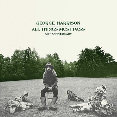
Music Reviews: George Harrison’s ‘All Things Must Pass’ (50th Anniversary Edition), Plus the Gun Club’s ‘Fire of Love’ (Deluxe Edition)
By Jeff BurgerThe "quiet Beatle" makes a loud splash with his first major solo album. Also, an expanded edition of… -
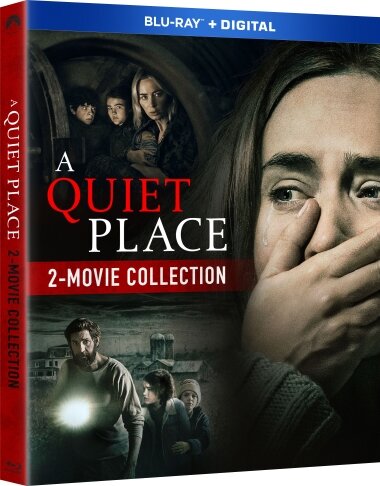
Blu-ray Review: A Quiet Place and A Quiet Place Part II - Two-Movie Collection
By Chaz LippThe excellent 'A Quiet Place' sequel is available on its own, but if you passed on adding the 2018 original…
Blu-ray Review: Those Who Wish Me Dead
This movie exists. Why, exactly, is anyone's guess. But it does star Angelina Jolie. So if you want to see one of the weakest performances of her career, check it out.
Blu-ray Review: Initiation - (2021)
Solidly-crafted thriller about some potentially-damaging cover-ups at a university and the influence of social medial over college students.
Blu-ray Review: Seance - (2021)
'Seance' is the directorial debut of screenwriter Simon Barrett, whose work has fared better when directed by Adam Wingard.
DVD Review: Lucky - (2021)
Don't believe the marketing campaign, this ain't a time-loop thriller or a horror film. Writer-star Brea Grant delivers a mess of a PSA masquerading as a "scary movie."
Blu-ray Review: Spiral: From the Book of Saw
A kinda-sorta 'Saw' movie that finds Chris Rock delivering solid work as a grizzled veteran police detective investigating murders committed by an apparent Jigsaw copycat.
Music Reviews: Archival Releases from Nina Simone, plus Dallas Burrow, Son Volt, Mick Kolassa, & Kate Taylor
A remastered edition of Simone's extraordinary 1958 debut and a collection of her live performances, plus more new CDs you should know about.
DVD Review: Room 9
Horror stars, including Kane Hodder, populate this experimental horror film. It may not tell a coherent story, but there is some off-the-wall intrigue to be found in this bizarre tale.
Music Reviews: A Must-see Concert Blu-ray from Little Steven, Plus Joan Armatrading
Stevie Van Zandt and his stupendous band shine in a new video release.
Blu-ray Review: A Quiet Place and A Quiet Place Part II - Two-Movie Collection
The excellent 'A Quiet Place' sequel is available on its own, but if you passed on adding the 2018 original to your collection, now is the time to grab this great twofer.
Blu-ray Review: Wrath of Man
Jason Statham stars in a high-adrenaline heist thriller directed by Guy Ritchie.
4K UltraHD Blu-ray Review: Space Jam
The Michael Jordan live-action/animated hybrid from 1996 gets a visual upgrade to coincide with the release of the long-overdue sequel.
Music Reviews: George Harrison’s ‘All Things Must Pass’ (50th Anniversary Edition), Plus the Gun Club’s ‘Fire of Love’ (Deluxe Edition)
The "quiet Beatle" makes a loud splash with his first major solo album. Also, an expanded edition of a 1981 punk/blues standout.
Music Reviews: Rolling Stones’ ‘Live on Copacabana Beach,’ Plus Steve Dawson and John R. Miller
A rock concert for one and a half million fans and two more noteworthy releases.
Blu-ray Review: Godzilla vs. Kong
Another entry in the Legacy/Warner Bros. MonsterVerse, a series plagued by uninteresting, F/X-heavy productions. The return of Kong might've signaled a return to the funny, inventive 'Skull Island.' But it's just more nonsense like 'King of the Monsters.'
Music Reviews: Van Morrison’s ‘Latest Record Project,’ Plus Our Band and Laura Nyro
The great Irish singer's new set is less than great. Also, an excellent new folk/pop duo and a live set reminds us that the late Laura Nyro could sing 'em as well as she could write 'em.
Blu-ray Review: Here Are the Young Men
Messy, frustrating film about three recent high school grads and the trouble they get up to. But thanks to a fascinating turn by Finn Cole, well worth checking out.
Music Reviews: An Expanded Edition of the Grateful Dead’s ‘Skull & Roses’ LP, plus Crowded House and Reigning Sound
An anniversary edition of the Dead's second album, Crowded House return after a decade, and an excellent CD from Reigning SOund.
Blu-ray Review: Voyagers - (2021)
Taking a few obvious cues from 'Lord of the Flies,' this outer-space teen drama boasts impressive production values but suffers from undeveloped ideas at its core.
Music Reviews: Leo Sayer, Wanderlust, Jack Grace Band, Dana Sipos, and a Tribute to an NRBQ Cofounder
Revisiting a British pop star's heyday, a multi-artist hat tip to NRBQ's Joey Spampinato, and more new releases.
Music Reviews: An Alligator Records Anthology and Tim Buckley Live plus Johnny Ace and the Four Tunes
An independent blues label showcases highlights from its first half-century. Also, a live set from the late, great Tim Buckley and anthologies from two early vocal acts.
- Where and how to find help with learning
- An exceptional essay service has been pivotal to our progress. With its 'write my essay for me' feature, we've efficiently handled academic workloads, allowing us to focus on broader strategies.
- This is where the services of Studyfy come into play, offering a wide range of academic assistance to help students excel in their studies. The best part? With the "Studyfy promo code," students can access these services at a discounted rate, making it an affordable option for those on a tight budget.
-

- What is The Art of Music Writing?
- Music Education
- Music Career Milestones
- The Art of Creative Writing
- Who Does Prince Harry Look Like?
- Inteview with Paul Levinson
- Why go to Great Shelford?
- Gadget Review: Globe Electric smart home products
From Gadget Inspector
By Michael Simpson - Gadget Gift Guide: Anker's Soundcore Liberty 2 Pro Wireless Earbuds
From Gadget Inspector
By Michael Simpson - Gadget Gift Guide: Anker's PowerExpand+ 7-in-1 USB-CD PD Ethernet Hub
From Gadget Inspector
By Michael Simpson - Gadget Review: Globe Electric's Soft White Dimmable Frosted LED Smart Bulb
From Gadget Inspector
By Michael Simpson - Gadget Review: Anker Innovations' Roav Bolt with Google Assistant
From Gadget Inspector
By Michael Simpson
Over 67 hours of old-school animation, this set marks the first time ever that all nine seasons of the venerable '90s-era favorite have been collected together. Announcement: Words on Bathroom Walls Due on Home Video November 17
"If you can't trust your mind, trust your heart," as the teen romance story arrives on Digital on November 10 and Blu-ray, DVD, On Demand a week later. Directed by Thor Freudenthal.
Not sure went wrong here. Oscar-nominated screenwriter making her directorial debut. Cult fave comic miniseries as source material. Three great stars - Melissa McCarthy, Tiffany Haddish, Elisabeth Moss - headlining.
A heist thriller with two marquee names but not enough thrills. Bruce Willis is really a supporting player here to Michael Chiklis. Should've been more interesting.
Double Emmy winner (for star/writer/director/creator Bill Hader and co-star Henry Winkler) this HBO Original Series is funny and quirky.
Ten episodes that look and sound great on HBO Home Entertainment's new three-disc Blu-ray set.
The 1953 beloved Disney animated classic is back in print - outfitted with some new bonus materials too.
The sequel to the 2015 hit family film has been met with universal acclaim. If you missed it in theaters, here comes your chance to get caught up at home.
Gal Gadot, Ben Affleck, and the DC Extended Universe gang arrive on a variety of physical home media formats on March 13. 'Justice League,' the fall 2017 blockbuster sequel to 'Batman v Superman: Dawn of Justice,' is also currently available as a Digital HD download.
The upcoming release boasts a complete performance of the entire 'Tommy' album, with a set of additional Who classics plus bonus features. Also available on CD and vinyl.
Pete Holmes created this funny HBO series about a struggling comedian. Holmes stars as a version of himself, and the new Blu-ray release includes one of his hour-long stand-up specials.
Lena Dunham's iconic HBO series winds up on a strong note with its sixth season, which is nominated for four Emmy Awards.
Legendary guitarist's 2016 concert featuring special guests including Steven Tyler and Buddy Guy will be available October 6, 2017 on multiple formats.
- Morton Report Insider Newsletter
- YouTube
- RSS
Recent Writers
- Jeff Burger, Music, film, popular culture
- Chaz Lipp, Music, Movies, Interviews
- Michael Simpson, Home Entertainment Tech
- Bill Bentley, Bentley's Bandstand

